Pantone’s Colour of The Year 2019: Living Coral (PANTONE 16-1546)
Introducing coral into your colour scheme might just be the boost your room needs, whether you go for all the varying shades, opting for more pink or more orange, or if you incorporate coral as an accent colour to your room, it’s set to be a summery winner.

Are you planning any design changes in your home? Why not take a look at our brochure to get some inspiration, just use the form below!
Moody Hues and All The Blues
Blue shades have been ever popular, but we are seeing more of the tranquil combinations over the past 6 months, using light aqua blues, mixed with deep, grey/blue tones, to create a calm aquatic feel. Blue’s are ideal for creating a feeling of serenity and calmness in any bedroom this year.

Pantone’s Colour of The Year 2019: Living Coral (PANTONE 16-1546)
Introducing coral into your colour scheme might just be the boost your room needs, whether you go for all the varying shades, opting for more pink or more orange, or if you incorporate coral as an accent colour to your room, it’s set to be a summery winner.
Are you planning any design changes in your home? Why not take a look at our brochure to get some inspiration, just use the form below!
A Pop of Yellow
A great example of a colour pop, is this moody colour pallet, comprising of dark blues and neutral shades, which provide a perfect base for an accent colour of a deep yellow. This rich mix of colours will bring depth to any room.

Moody Hues and All The Blues
Blue shades have been ever popular, but we are seeing more of the tranquil combinations over the past 6 months, using light aqua blues, mixed with deep, grey/blue tones, to create a calm aquatic feel. Blue’s are ideal for creating a feeling of serenity and calmness in any bedroom this year.
Pantone’s Colour of The Year 2019: Living Coral (PANTONE 16-1546)
Introducing coral into your colour scheme might just be the boost your room needs, whether you go for all the varying shades, opting for more pink or more orange, or if you incorporate coral as an accent colour to your room, it’s set to be a summery winner.
Are you planning any design changes in your home? Why not take a look at our brochure to get some inspiration, just use the form below!
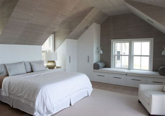
Grey Isn’t Doom and Gloom
Over the last 2 years, you will have seen more and more interior designs following a grey colour scheme, which has only continued into 2019, with varying shades of grey and silver, often mixed with a pop of colour.

A Pop of Yellow
A great example of a colour pop, is this moody colour pallet, comprising of dark blues and neutral shades, which provide a perfect base for an accent colour of a deep yellow. This rich mix of colours will bring depth to any room.
Moody Hues and All The Blues
Blue shades have been ever popular, but we are seeing more of the tranquil combinations over the past 6 months, using light aqua blues, mixed with deep, grey/blue tones, to create a calm aquatic feel. Blue’s are ideal for creating a feeling of serenity and calmness in any bedroom this year.
Pantone’s Colour of The Year 2019: Living Coral (PANTONE 16-1546)
Introducing coral into your colour scheme might just be the boost your room needs, whether you go for all the varying shades, opting for more pink or more orange, or if you incorporate coral as an accent colour to your room, it’s set to be a summery winner.
Are you planning any design changes in your home? Why not take a look at our brochure to get some inspiration, just use the form below!
Woodland Shades
In 2019 Woodland shades are growing in popularity, with more and more homes incorporating wooden and muted brown tones to create a peaceful, natural environment.

Grey Isn’t Doom and Gloom
Over the last 2 years, you will have seen more and more interior designs following a grey colour scheme, which has only continued into 2019, with varying shades of grey and silver, often mixed with a pop of colour.
A Pop of Yellow
A great example of a colour pop, is this moody colour pallet, comprising of dark blues and neutral shades, which provide a perfect base for an accent colour of a deep yellow. This rich mix of colours will bring depth to any room.
Moody Hues and All The Blues
Blue shades have been ever popular, but we are seeing more of the tranquil combinations over the past 6 months, using light aqua blues, mixed with deep, grey/blue tones, to create a calm aquatic feel. Blue’s are ideal for creating a feeling of serenity and calmness in any bedroom this year.
Pantone’s Colour of The Year 2019: Living Coral (PANTONE 16-1546)
Introducing coral into your colour scheme might just be the boost your room needs, whether you go for all the varying shades, opting for more pink or more orange, or if you incorporate coral as an accent colour to your room, it’s set to be a summery winner.
Are you planning any design changes in your home? Why not take a look at our brochure to get some inspiration, just use the form below!
All Green Everything
The colour green relates to balance and harmony, which is an ideal bedroom scheme to keep your space a peaceful environment.

Woodland Shades
In 2019 Woodland shades are growing in popularity, with more and more homes incorporating wooden and muted brown tones to create a peaceful, natural environment.
Grey Isn’t Doom and Gloom
Over the last 2 years, you will have seen more and more interior designs following a grey colour scheme, which has only continued into 2019, with varying shades of grey and silver, often mixed with a pop of colour.
A Pop of Yellow
A great example of a colour pop, is this moody colour pallet, comprising of dark blues and neutral shades, which provide a perfect base for an accent colour of a deep yellow. This rich mix of colours will bring depth to any room.
Moody Hues and All The Blues
Blue shades have been ever popular, but we are seeing more of the tranquil combinations over the past 6 months, using light aqua blues, mixed with deep, grey/blue tones, to create a calm aquatic feel. Blue’s are ideal for creating a feeling of serenity and calmness in any bedroom this year.
Pantone’s Colour of The Year 2019: Living Coral (PANTONE 16-1546)
Introducing coral into your colour scheme might just be the boost your room needs, whether you go for all the varying shades, opting for more pink or more orange, or if you incorporate coral as an accent colour to your room, it’s set to be a summery winner.
Are you planning any design changes in your home? Why not take a look at our brochure to get some inspiration, just use the form below!
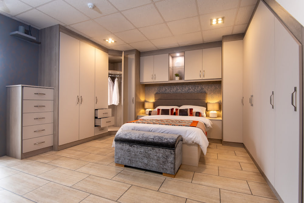
One of the most exciting things about redesigning any room in your home is flipping through countless colour swatches and planning your new look.
In 2019 there are some core colour pallets that are shining through, here’s our top list of bedroom colour schemes this year!
Pretty In Pinks
We’ve noticed a real rise in pinks this year, specifically the dusty pink, which is complimentary of the ever-popular grey tones.

All Green Everything
The colour green relates to balance and harmony, which is an ideal bedroom scheme to keep your space a peaceful environment.
Woodland Shades
In 2019 Woodland shades are growing in popularity, with more and more homes incorporating wooden and muted brown tones to create a peaceful, natural environment.
Grey Isn’t Doom and Gloom
Over the last 2 years, you will have seen more and more interior designs following a grey colour scheme, which has only continued into 2019, with varying shades of grey and silver, often mixed with a pop of colour.
A Pop of Yellow
A great example of a colour pop, is this moody colour pallet, comprising of dark blues and neutral shades, which provide a perfect base for an accent colour of a deep yellow. This rich mix of colours will bring depth to any room.
Moody Hues and All The Blues
Blue shades have been ever popular, but we are seeing more of the tranquil combinations over the past 6 months, using light aqua blues, mixed with deep, grey/blue tones, to create a calm aquatic feel. Blue’s are ideal for creating a feeling of serenity and calmness in any bedroom this year.
Pantone’s Colour of The Year 2019: Living Coral (PANTONE 16-1546)
Introducing coral into your colour scheme might just be the boost your room needs, whether you go for all the varying shades, opting for more pink or more orange, or if you incorporate coral as an accent colour to your room, it’s set to be a summery winner.
Are you planning any design changes in your home? Why not take a look at our brochure to get some inspiration, just use the form below!